borderを要素の途中で区切りたいときに使うCSSを紹介していきます。
タイトルではborderを半分にするとありますがborderプロパティは使わずに、疑似要素(今回はbefore)で実現します。
目次
width、heightとpositionで設定する
横線
.border {
  display: inline-block;
  position: relative;
  font-weight: bold;
  padding-bottom: 1em;
}
.border:before {
  position: absolute;
  content: "";
  width: 50%;
  height: 2px;
  background-color: blue;
  left: 0;
  /* left: 50%; ※右側に当てたい場合 */
  bottom: 0;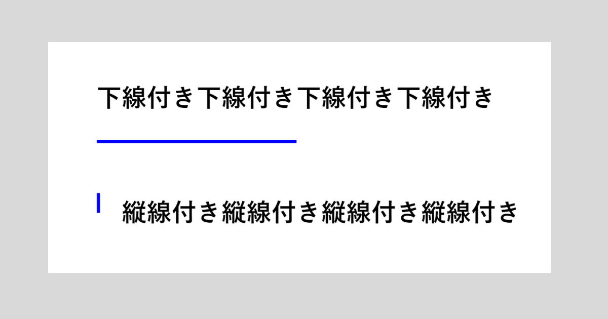
}下線の幅を要素の幅と合わせるためにdisplay: inline-blockを当てています。
widthに50%を指定することでborderを半分にすることができます。
右側に寄せたい場合は疑似要素(before)にleft: 50%を当てましょう
縦線
.border {
  position: relative;
  font-weight: bold;
  padding-left: 1em;
}
.border:before {
  position: absolute;
  content: "";
  width: 2px;
  height: 50%;
  background-color: blue;
  top: 0;
  /* top: 50% ※下側に当てたい場合 */
  left: 0;
}linear-gradientで設定する
続いてliner-gradientを使用しての方法です。疑似要素の背景色を編集してborderが半分の見栄えを再現します。
横線
.border {
  display: inline-block;
  position: relative;
  font-weight: bold;
  padding-bottom: 1em;
}
.border:before {
  position: absolute;
  content: "";
  width: 100%;
  height: 2px;
  left: 0;
  background: linear-gradient(to right, blue 0%, blue 50%, transparent 50%, transparent 100%);
  /* background: linear-gradient(to left, blue 0%, blue 50%, transparent 50%, transparent 100%) ※右側に当てたい場合 */
  bottom: 0;
}注意しなければいけないのはlinear-gradientをbackgroundに当てることです。background-colorでは反映されません。
縦線
.border {
  position: relative;
  font-weight: bold;
  padding-left: 1em;
}
.border:before {
  position: absolute;
  content: "";
  width: 2px;
  height: 100%;
  background: linear-gradient(to bottom, blue 0%, blue 50%, transparent 50%, transparent 100%);
  /* background: linear-gradient(to top, blue 0%, blue 50%, transparent 50%, transparent 100%) ※下側に当てたい場合 */
  top: 0;
  left: 0;
}要素が連続する場合(おまけ)
要素が連続して下記のような見栄えにしたいときのコードもご紹介します。

first-of-type、last-of-typeを使用します。要素が増えても表示崩れしません。
HTMLは単純に要素を3つ並べます
<div class="border" >縦線付き縦線付き縦線付き縦線付き</div>
<div class="border" >縦線付き縦線付き縦線付き縦線付き</div>
<div class="border" >縦線付き縦線付き縦線付き縦線付き</div>
height使用
.border {
  position: relative;
  font-weight: bold;
  padding-left: 1em;
}
.border:before {
  position: absolute;
  content: "";
  width: 2px;
  height: 100%;
  background-color: blue;
  top: 0;
  left: 0;
}
.border:first-of-type:before, .border2:last-of-type:before {
  height: 50%;
}
.border:first-of-type:before {
  top: 50%;
}linear-gradient使用
.border {
  position: relative;
  font-weight: bold;
  padding-left: 1em;
}
.border:before {
  position: absolute;
  content: "";
  width: 2px;
  height: 100%;
  background-color: blue;
  top: 0;
  left: 0;
}
.border:first-of-type:before, .border2:last-of-type:before {
  background: linear-gradient(to top, blue 0%, blue 50%, transparent 50%, transparent 100%);
}
.border:last-of-type:before {
  background: linear-gradient(to bottom, blue 0%, blue 50%, transparent 50%, transparent 100%);
}